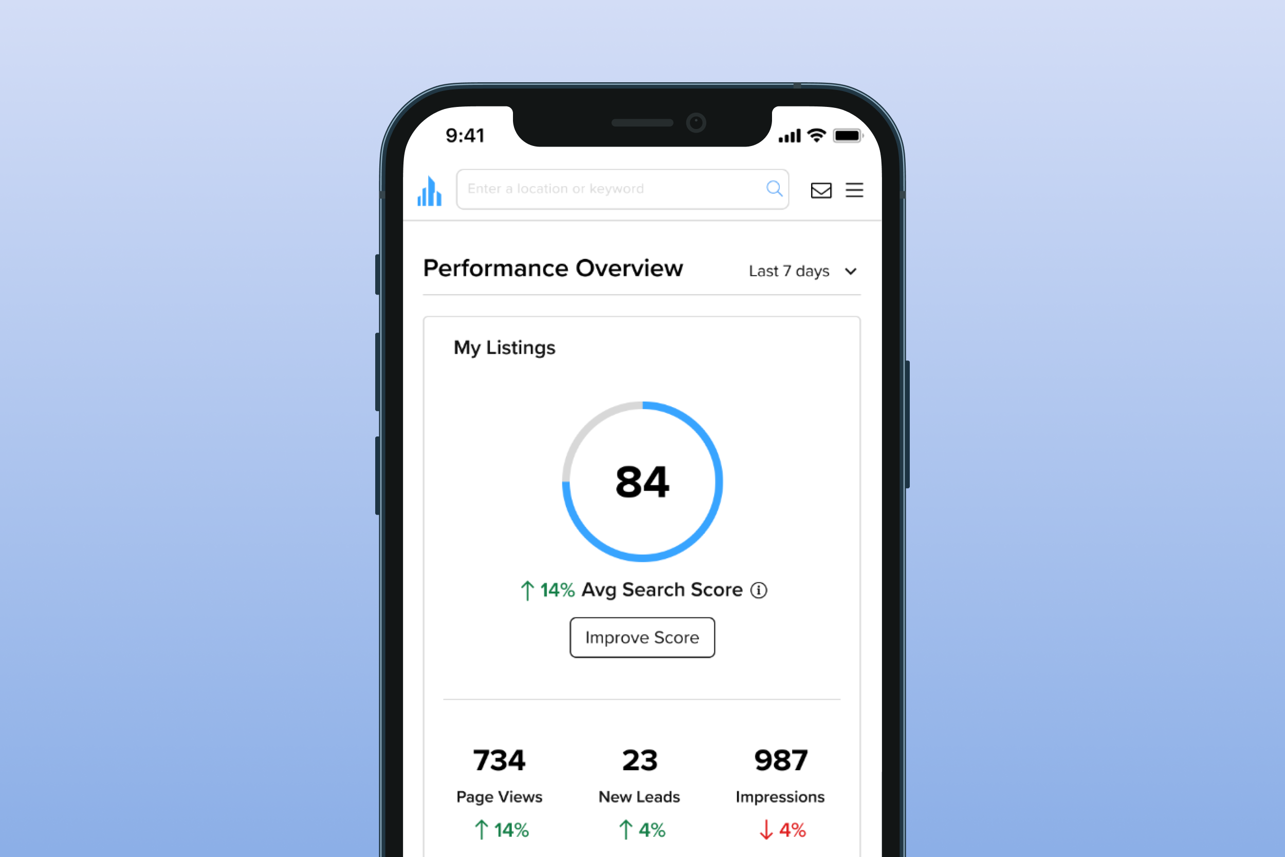
Crexi’s Broker Homepage Dashboard
Platform
Mobile Web | Desktop
Timeline
3 months
Role
Research, UX, & Visual Design
Team
PM, Data Analyst & 8 Engineers
Background
Crexi is a commercial real estate platform meant to help buyers and sellers close deals. The broker tooling team was focused on the seller side building tools for brokers to manage, market, analyze and sell commercial properties.
User Problem
Brokers were having trouble managing multiple listings, their profiles, and communication with leads across the platform.
Business Problem
Crexi was seeing a major drop-off in engagement outside a few core features. Brokers were logging in to gather leads, but they weren’t using Crexi’s tools to continue to engage with leads resulting in missed messages and out of date listings.
Goal
Improve engagement by helping brokers monitor their property’s performance, and to connect with leads on the platform.
Measures of Success:
Broker engagement across platform, Brokers connecting with leads, and Property updates
Understanding the problem
User Interviews
I started by conducting a series of user interviews hoping to better understand brokers current pain points with Crexi, what tools they used most, and what their current work flow within Crexi. I also wanted to get a clearer picture of a brokers typical work day, how they communicate with leads, and how Crexi might fit into a brokers day to day.
Key Takeaways
Users had no overview to manage multiple properties and incoming leads
Users regularly went to 5 disparate areas of the app with siloed views of individual properties, and the leads associated
There was nothing that gave a high level view of how brokers properties were performing overall, or what might need attention.
It was hard for brokers to manage leads coming in across properties.
Users were having trouble finding and messaging new leads
It took 3 steps to find leads to message
It took a total of 5 steps to actually send a lead a message
User Persona & Jobs to be done
User Persona
With a better understanding of how Crexi could fit in to brokers day to day workflow I was able to develop a user persona.
Jobs to be done
Monitor and Optimize listings
Market listings
Find new leads for listings
Manage relationships with existing leads
Keep profile up to date (to maintain high search score)
Prioritizing based on value and effort
With a better understanding of brokers pain points and ways of working, I worked with the team to prioritize what we believed we could provide in a dashboard.
Design
User flows
I started the design process by thinking through the users flows and how we wanted the dashboard to increase broker engagement with other areas of the app.
Information Architecture
With basic flows in place, I started to synthesize the various elements we wanted to include in the dashboard and group them based on performance metrics, and action items brokers could engage with.
Layout & Wireframes
I started exploring layouts based on the information we knew wanted to include and what we heard from brokers in terms of priority. Once I felt good about the placement of the elements, I began developing a higher fidelity wireframe focused on simplifying existing components.
User Testing
Round One
For round one of testing I prioritize the profile and action required sections. I also presented views that gave details of specific areas brokers could take action on including Messaging previews, Property listings and Marketing campaigns.
Key Learnings from round one
Users found this concept to be overwhelming
Too much detail per section
Hard to prioritize
Action Required Section
Users didn’t find this section as pressing as new leads
Found the language to be a little bit “harsh”
Marketing Engagement
User more concerned with listing stats than how marketing was doing
Round Two
For the second round, I separated performance and action items to help users focus, I toned down the action required section with a “Recommendation” section, and I simplified the granular messaging and marketing components in favor of a more high-level view.
Key Learnings from round two
Excited by the visual nature of the performance overview
Aggregate stats held users interest
Profile now felt hidden with other metrics
Grouping performance and action items helped users focus
“This helps me focus one section at a time.”
Better response to “Recommendations” over “Action required”
Staying high-level helped users know what to take immediate action on
Appreciated filtered messaging
Marketing stats were interesting, but not a priority for users
Top prospects
Found users wanted to see more about a lead before reaching out
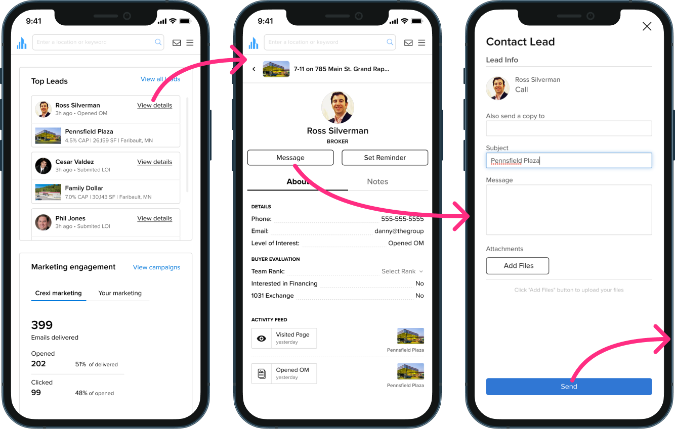
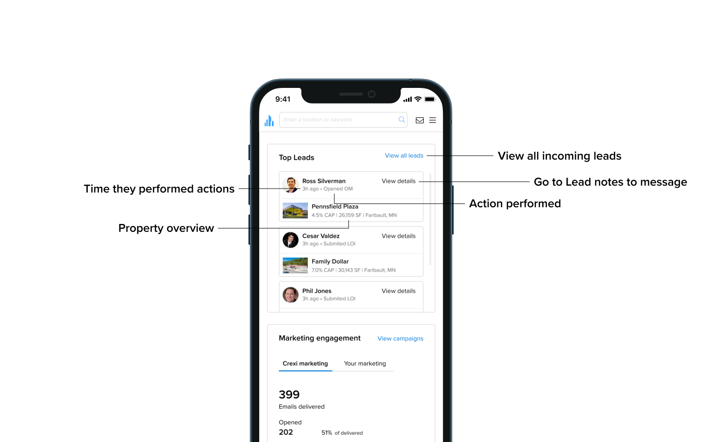
View details > instant message
Final Designs
Progressive Empty States
When a broker first signs up, the dashboard is focused on getting the broker to add their first listing, update their profile and upgrade to pro.
As the broker lists a property and updates their profile, the empty states change. The metrics start to show up, and the empty states focus on getting the broker acquainted to other areas of the app.
Populated Dashboard
Once a broker lists a property and updates their profile, the dashboard becomes populated with their performance overview, recommendations, incoming leads and marketing engagement.
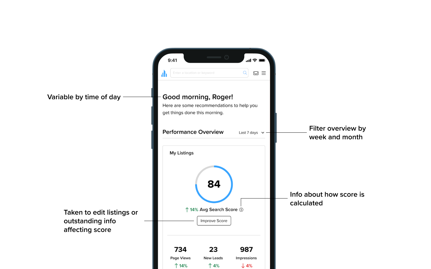
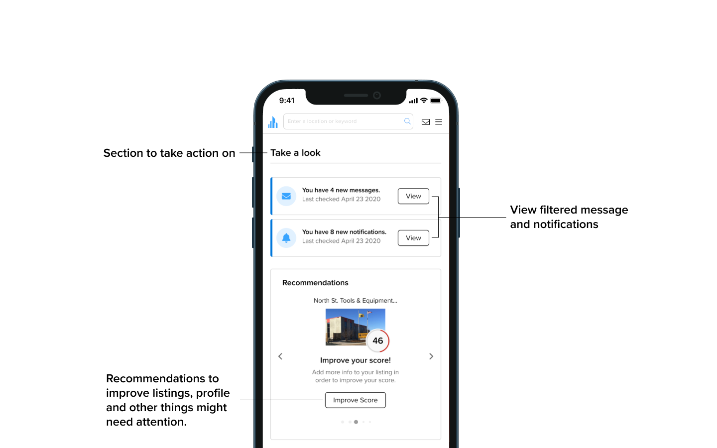

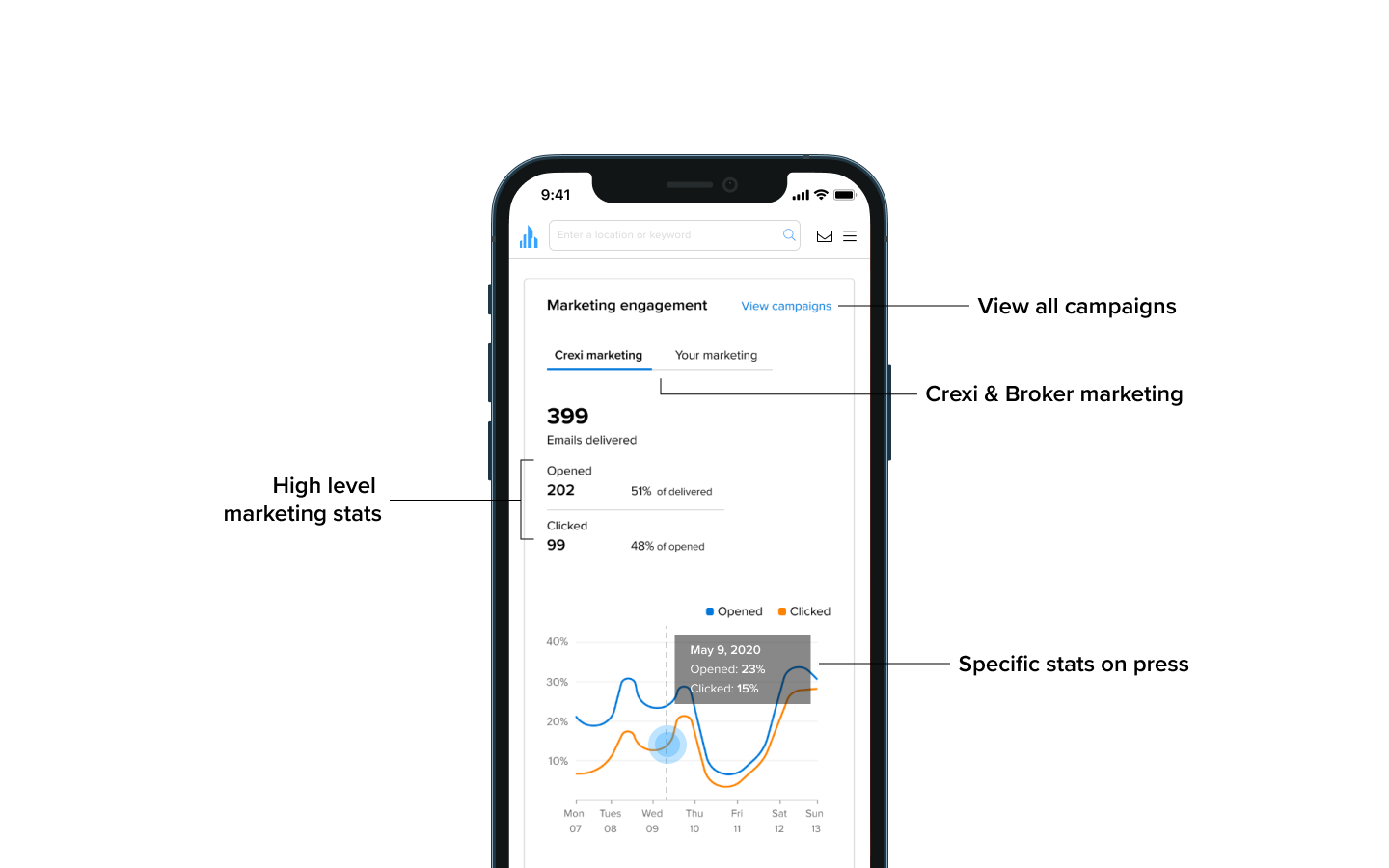
Desktop states
Improved workflow for contacting new leads
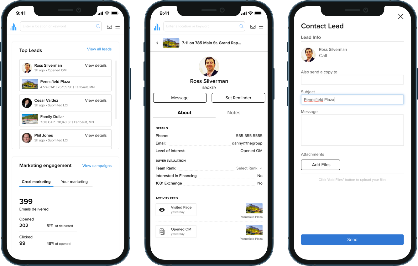
From our initial audit and interviews we need users were having trouble finding and connecting with leads across properties. With the dashboard, we were able to reduce the steps to contacting a lead from 5 to 2, allowing them to first view the leads profile and previous actions before immediately reaching out.
Outcomes
Once released to production platform engagement went up from 50% to 77% within 3 months
The dashboard successfully increased engagement across targeted areas including Messaging, Lead mgmt, Lead Activity, the Property Dashboard, and My Listings.
On platform messages between brokers and leads also showed improvement

